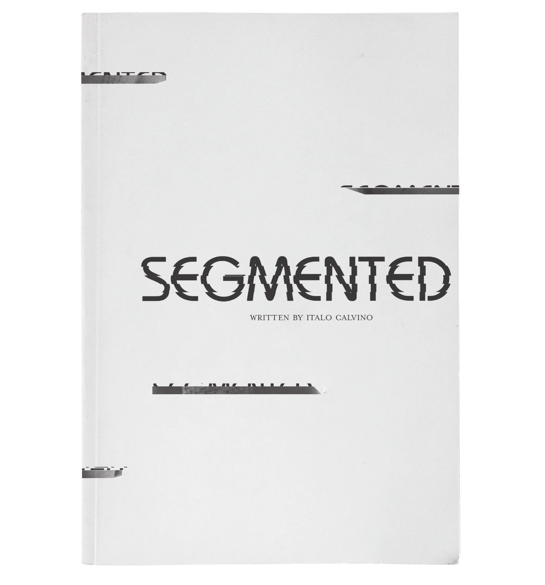
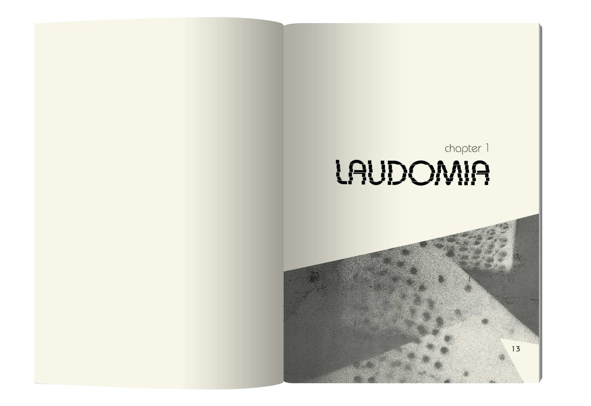
After reading Italo Calvino’s book, I felt a lot of the cities felt split. The word ‘segmented’ came to mind; this word drove the design. Words are segmented and appear disjointed, conveying an eerie feel to the reader. I also made my own commas, using various parts of letters and images I made for the book. I used Bauhaus for headings and subheads, while using Mrs. Eaves for the body text.
You can view the animation for this project by clicking here.
In this project, we were tasked with creating material in conjunction with a new piece the Arianna String Quartet had recorded.
I incorporated the use of sound vibration to create an illustration and formed it around the outline of a violin. The large lettering I chose to use Neutra, while picking Frutiger to use as the smaller text.
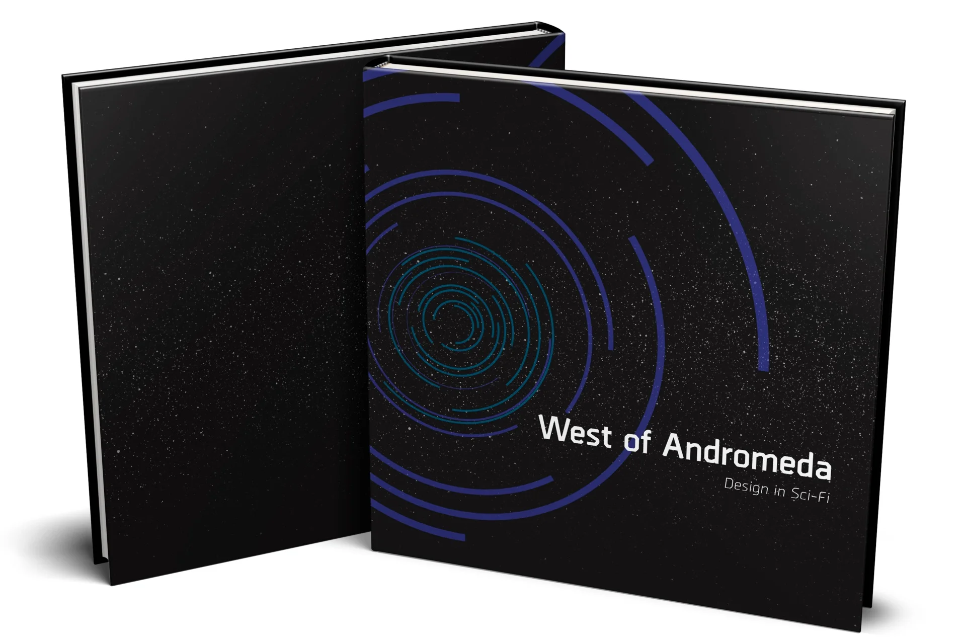
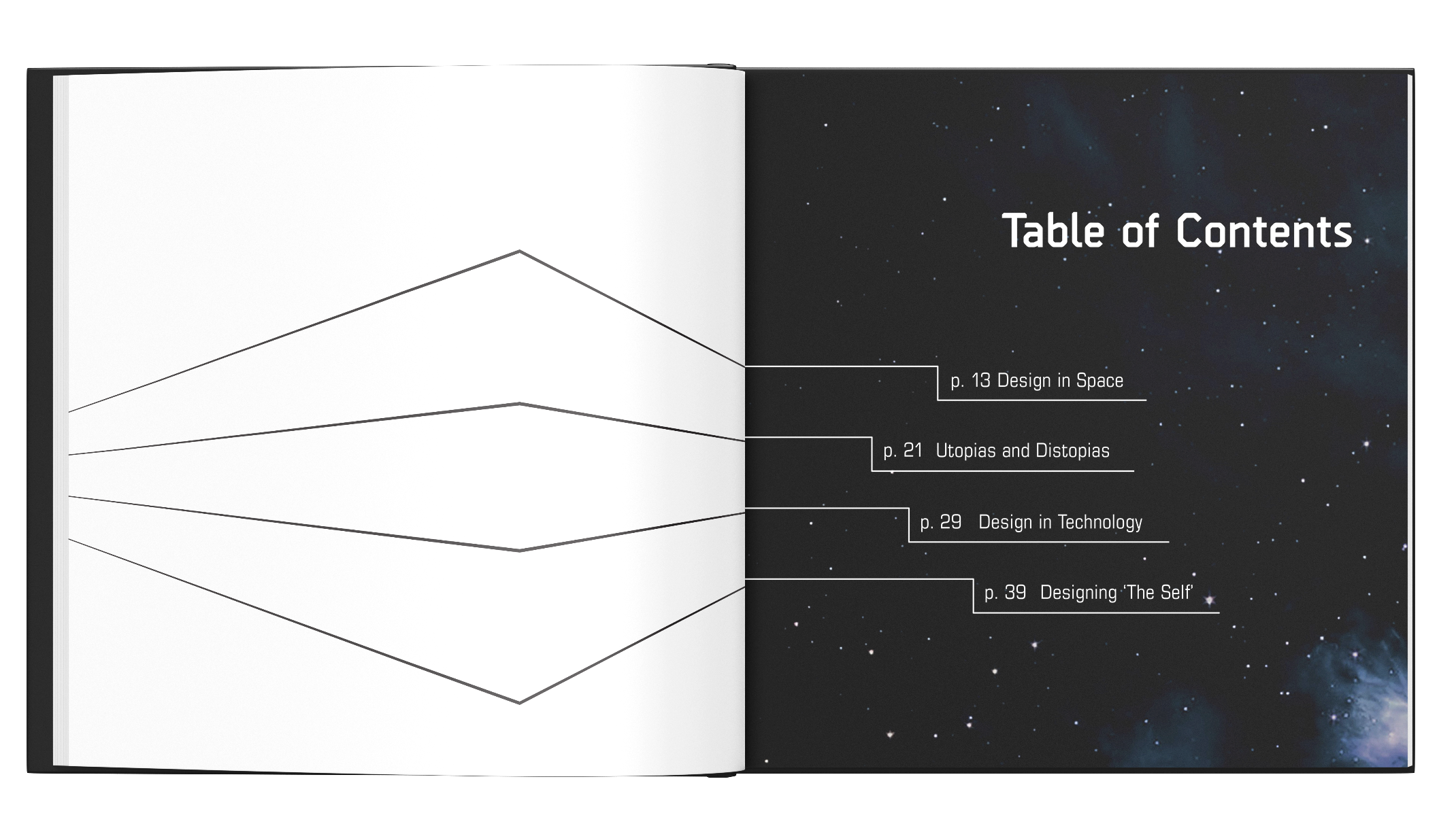
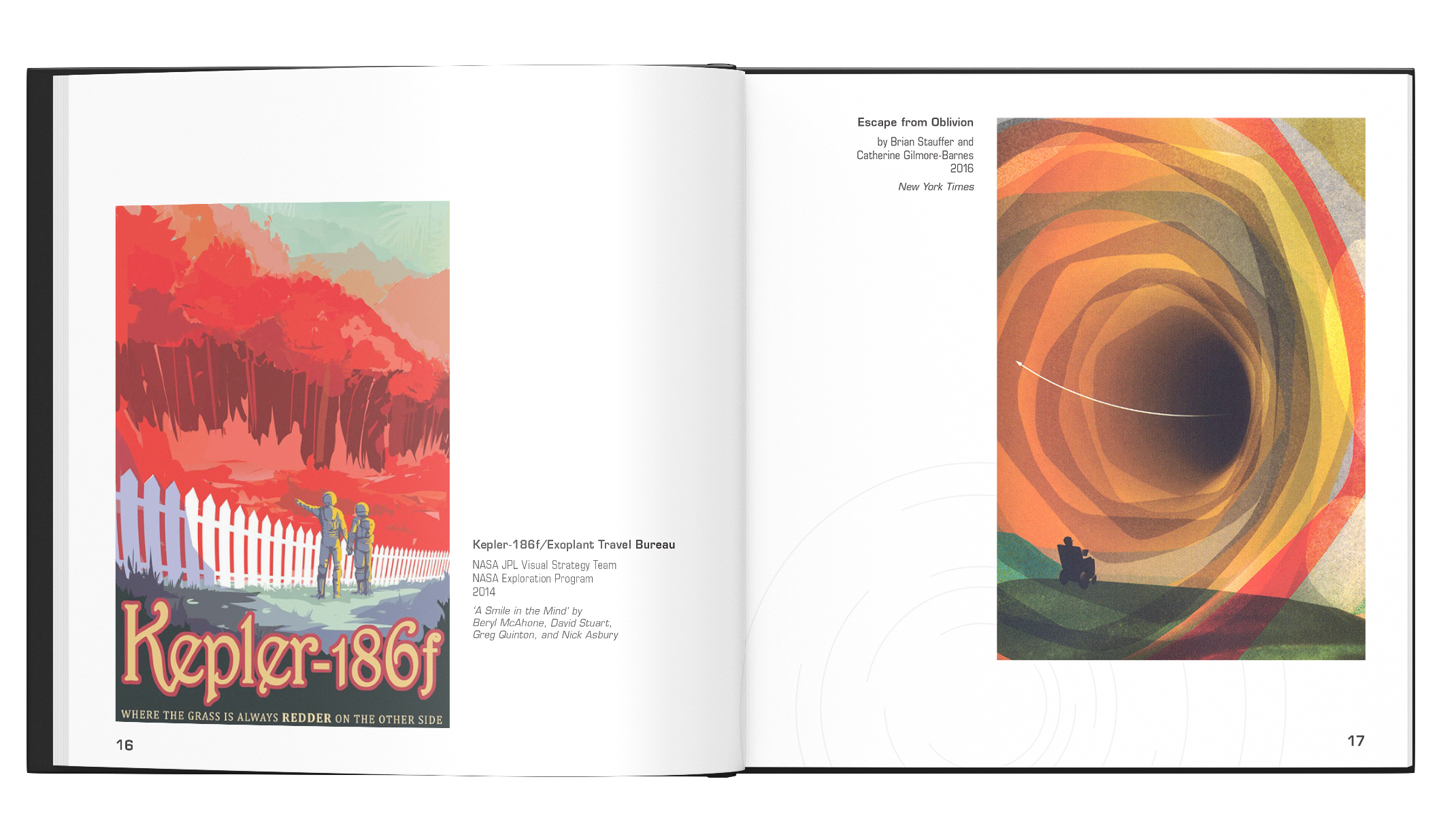
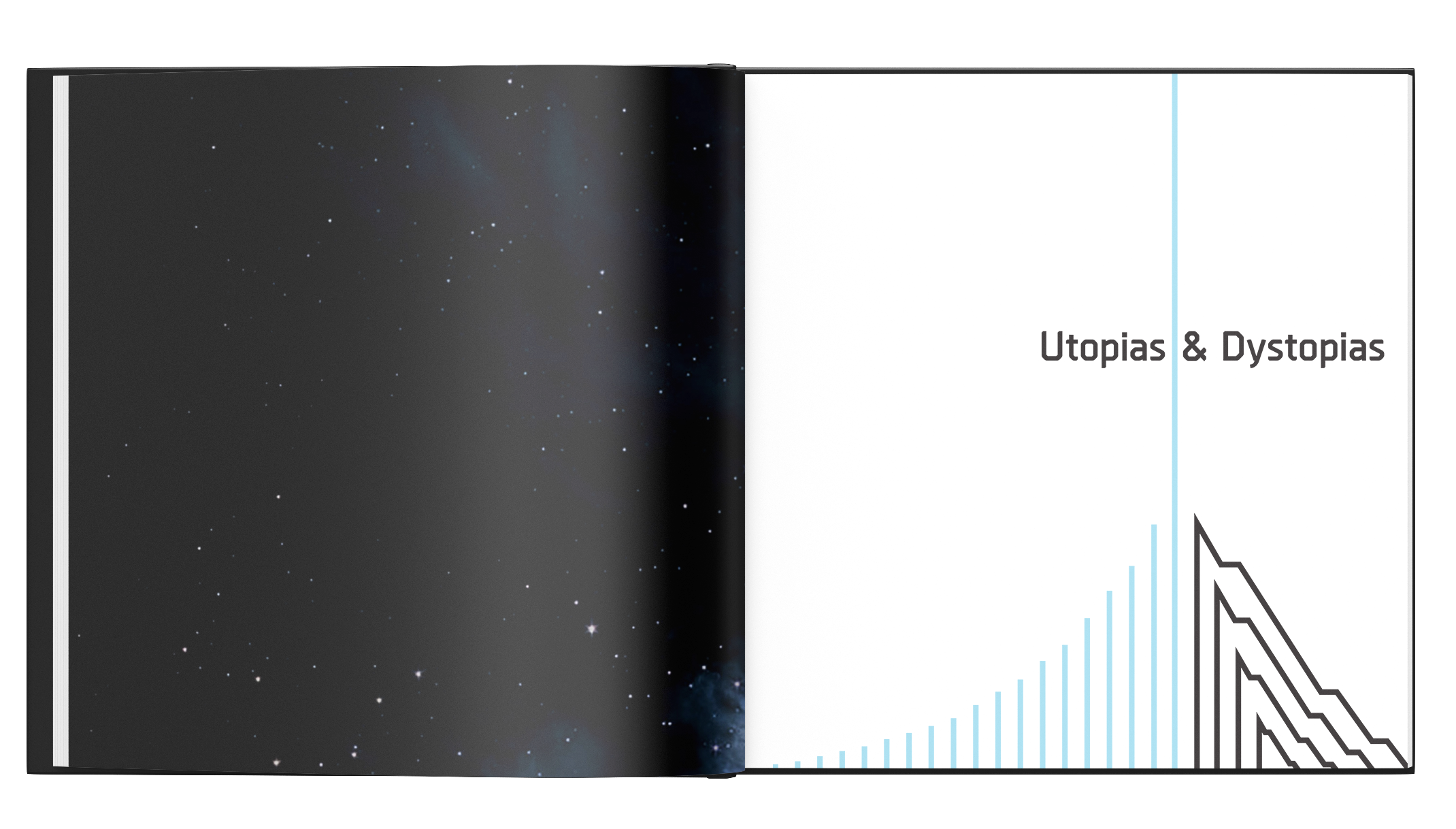
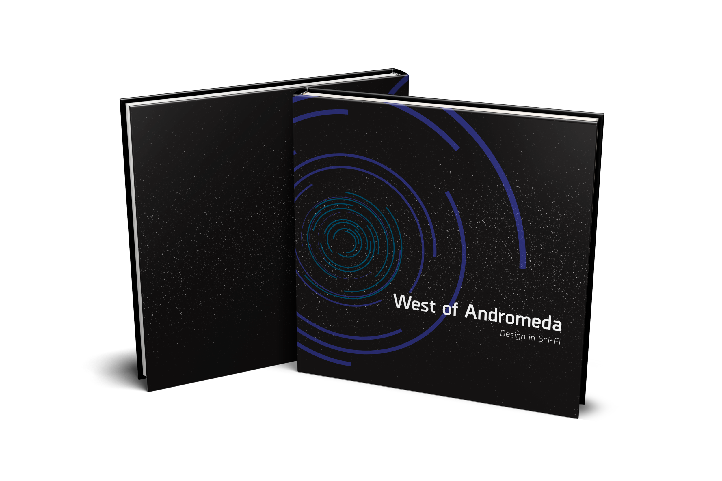
One of my favorite subjects I’ve worked with, ‘West of Andromeda’ takes a look at good design used in the science fiction genre. Utilizing line art, I created the book cover and chapter openings with lines to form certain aspects from science fiction. I used Borda for the header and subheads, while using Eurostile Condensed for the body copy.
Click below for the following episodes:
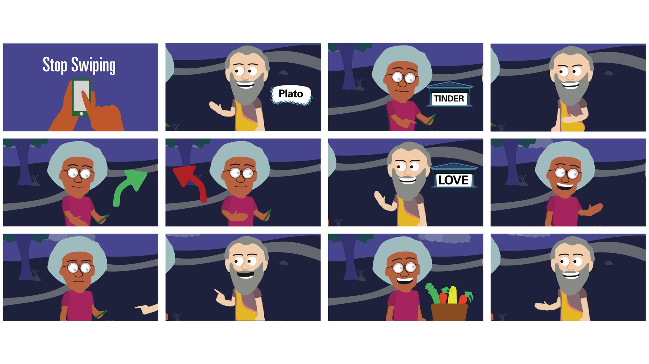
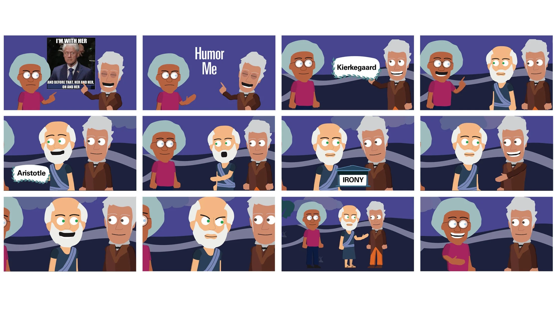
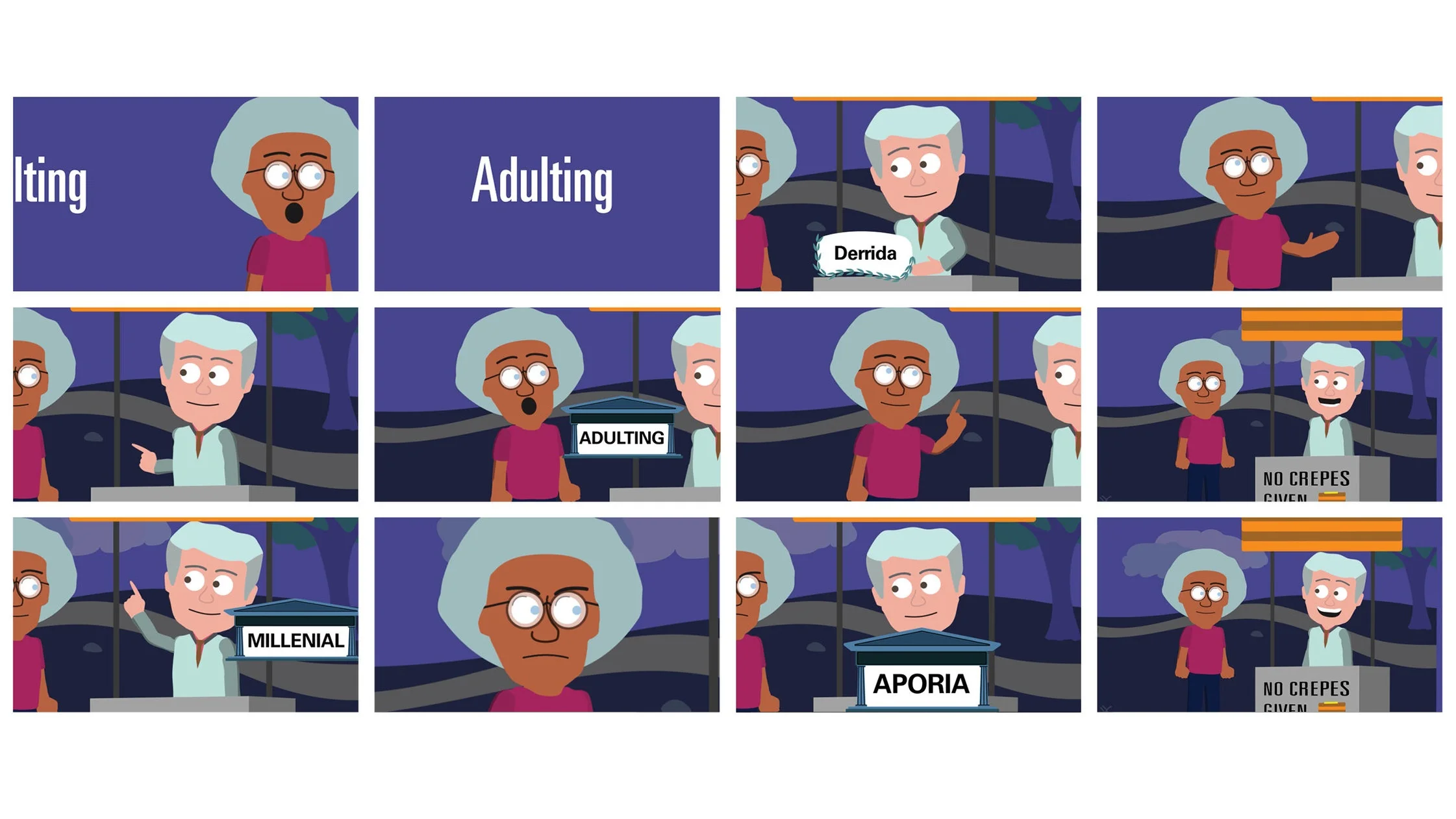
Stop Swiping Humor Me Adulting
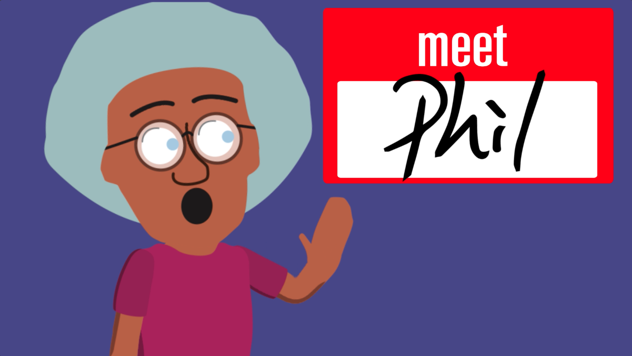
My senior thesis project is an animation project, creating three cartoons that deal with various modern social talking points. The cartoons center around Phil (the main character, and a shorter way of saying ‘Meet Philosophy’) who meets a few classical philosophers. The cartoons are humorous, yet have nuggets of info on how classic philosophy can still be applicable today.
The goal was to generate more interest in philosophy, and more importantly in better decision making for everyday life. Philosophy has fallen to the wayside in both academia and everyday life, and I felt this would be a humorous but educational stepping stone to help reverse this effect.
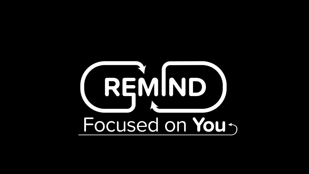
The logo animation features rotating letters, with two lines circling around to meet in the middle. The lines will form two arrows pointing to the ‘M,’ emphasizing the idea of fortifying good memory techniques.
‘Caliber’ is a lower-end liquor, commonly found in superstores such as Wal-Mart. I rebranded the whole product, revamping the logo and name itself. I included a pattern that wrapped around the bottle to add an intriguing aspect to the bottle.
Click here to watch the video.
Being a huge fan of movies, I’ve seen every James Bond movie. The first Bond movie I ever saw was “The Living Daylights” and at the age of 9 I was hooked.
Studying what Maurice Binder had done with the design work, I came up with some ideas to incorporate lights from a headlight. This is a pretty conceptual motion clip, but I’m really proud of what the finished product turned out to be.
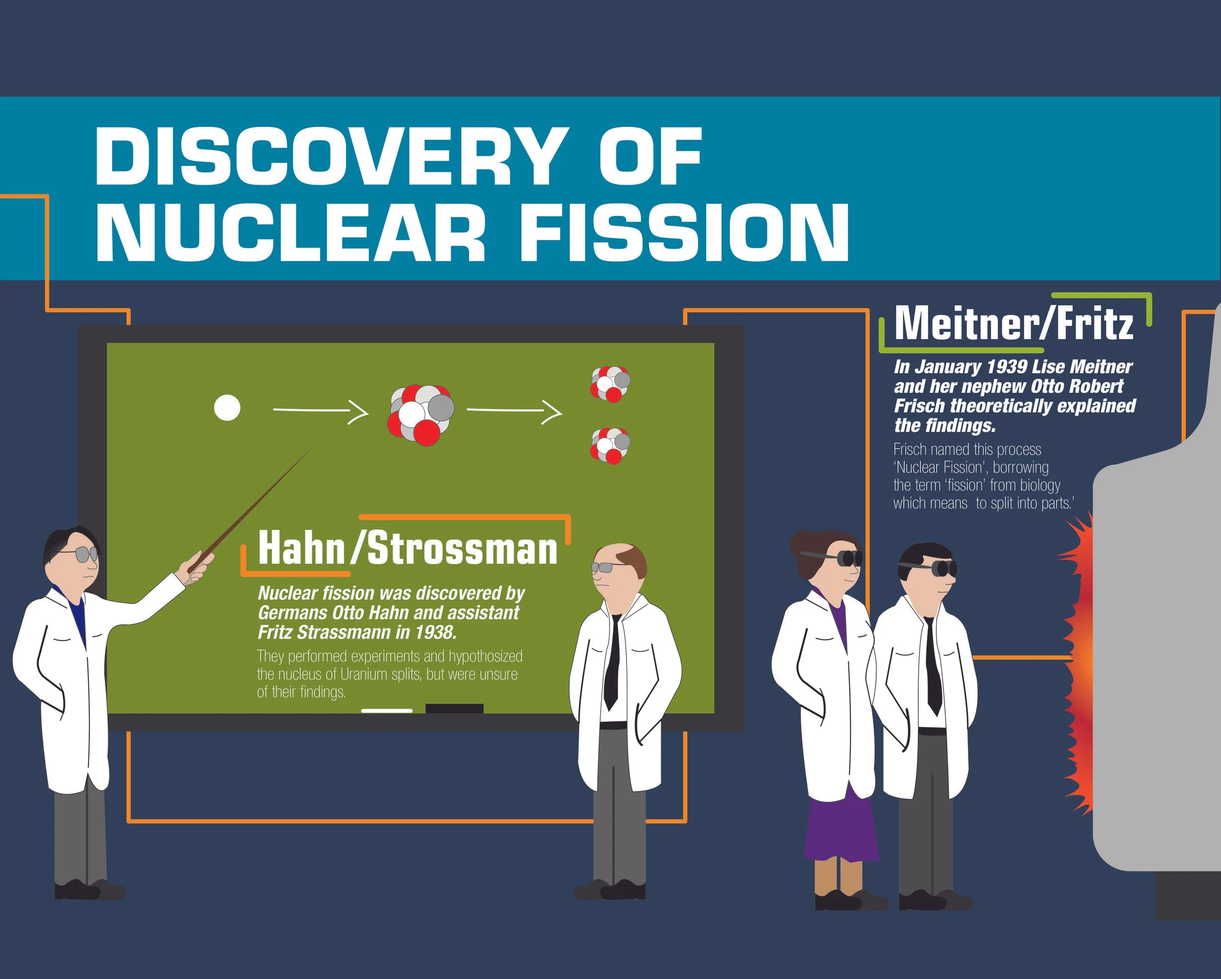
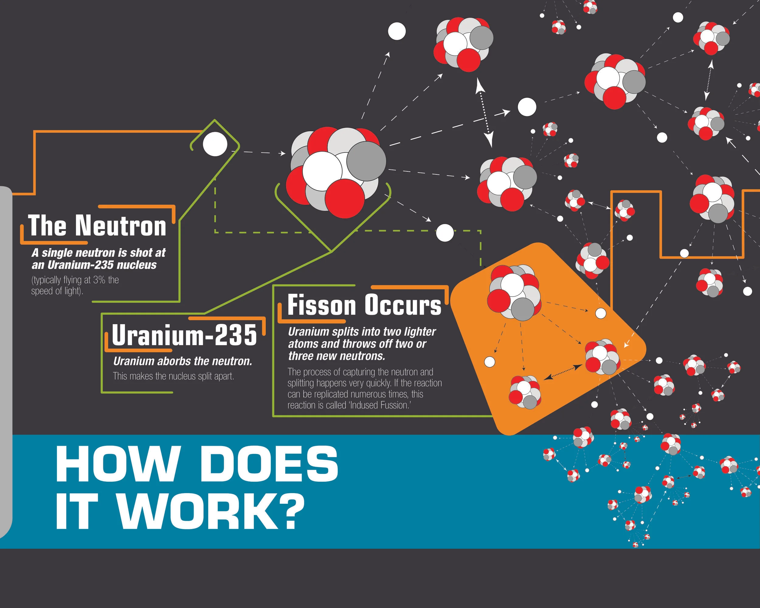
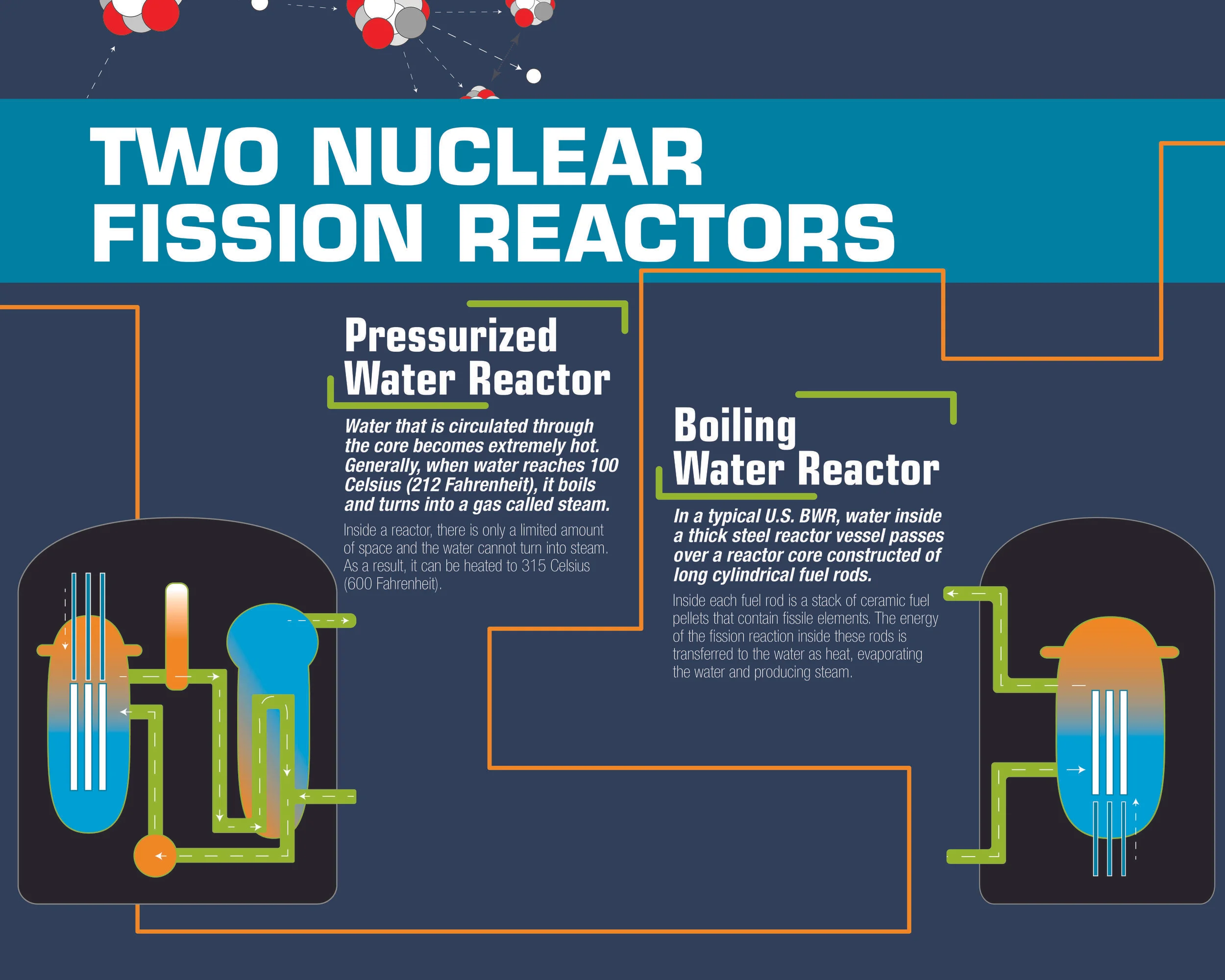
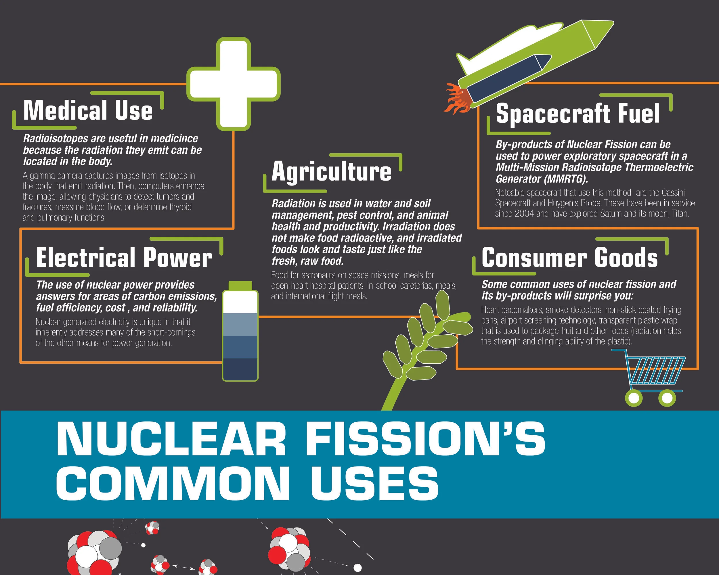
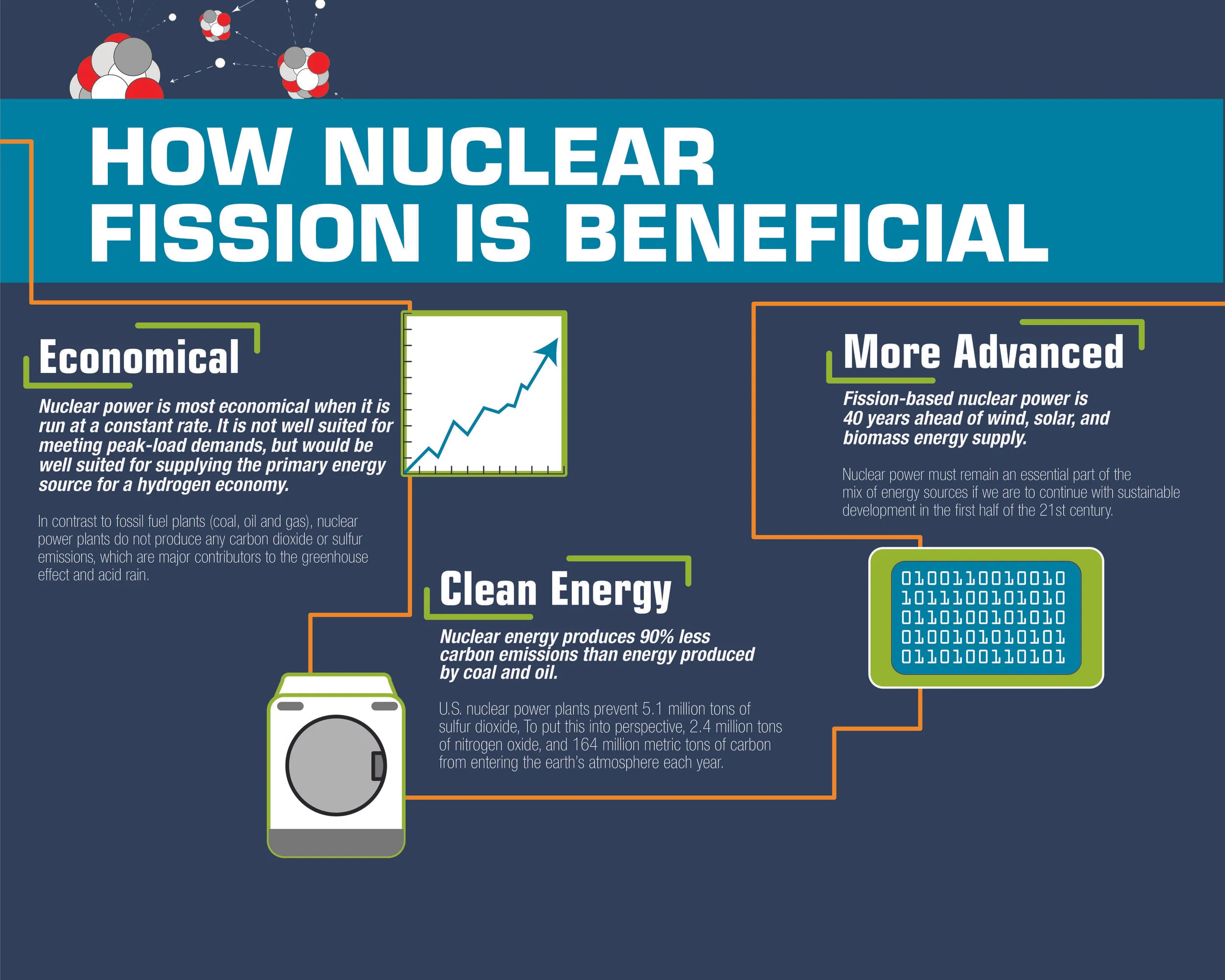
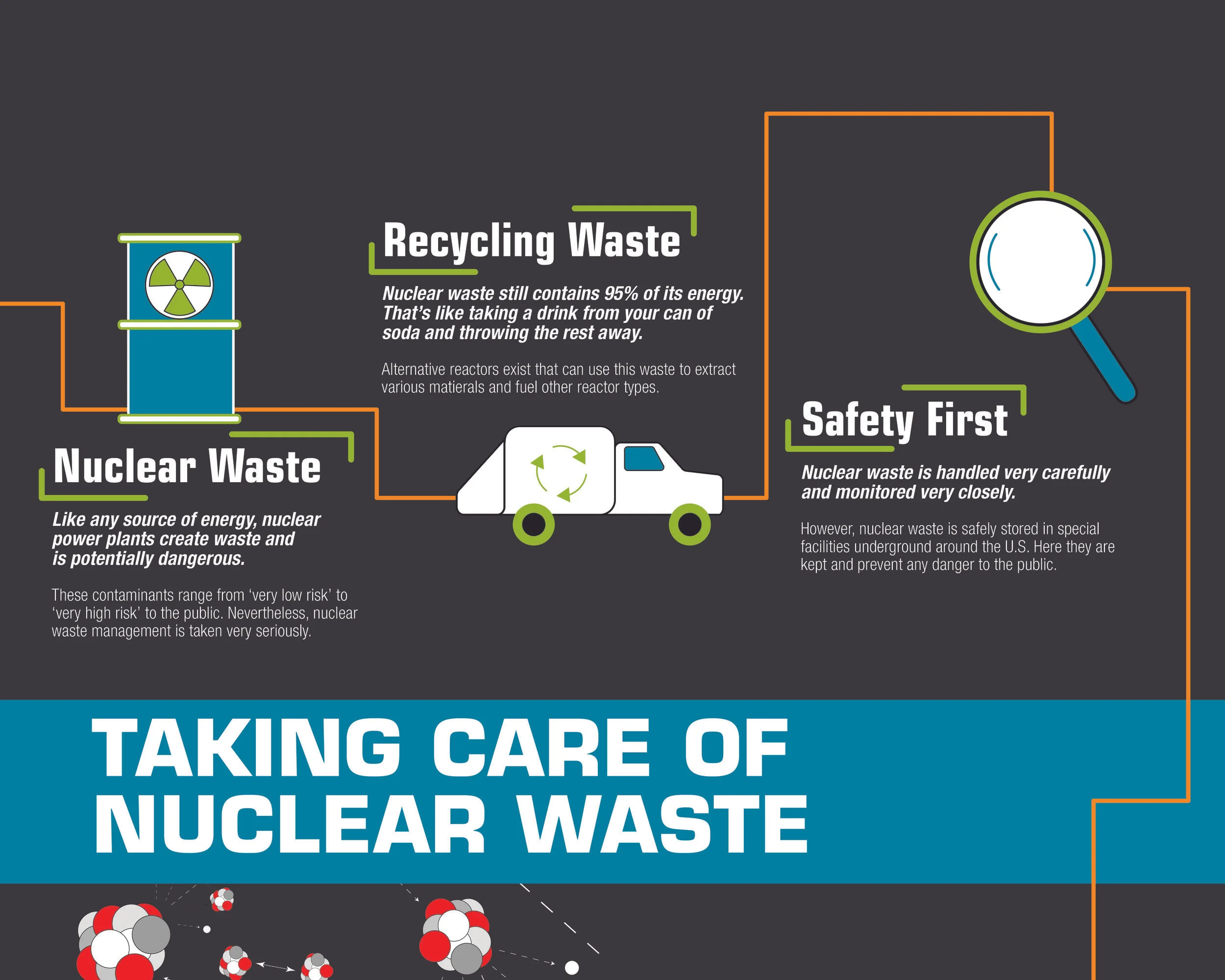
The illustration style is directed at younger age groups, encouraging them to look and read while also seeing aesthetically pleasing icons and pictures. Nuclear Fission was a fun choice, deciding to highlight the many good things that are done with the process.
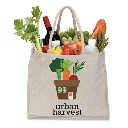
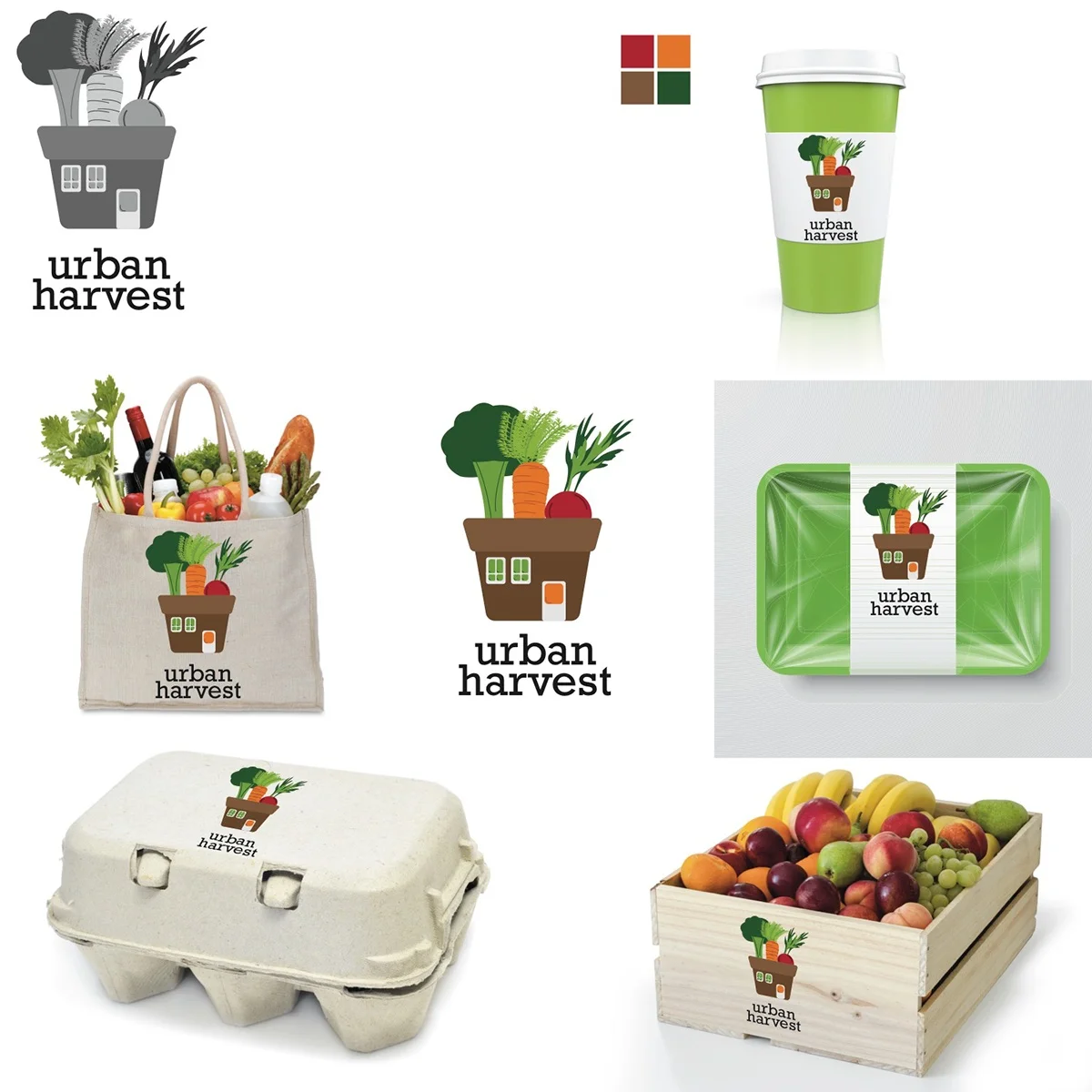
Based on a healthy foods store, my goal was to make the logo look fun and not take itself too seriously. Using colors associated with fruits and vegetables, I made the store appear to be a garden pot, with vegetables and fruit popping out of it.